Not all business-to-business (B2B) websites are created equal. In this article, we’ll focus on and explore best practices in B2B website design and development, share some impactful design examples, and take you through the key strategic components that can help you build a website that meets your practical everyday needs, engages customers, and delivers tangible business results.
What is a B2B Website?
Simply put, a B2B website promotes or sells products, services, and solutions from one business to other businesses. In this respect, it is distinct from a website selling products to the general consumer market, or websites operating solely in the public sector selling only to government organisations.
B2B web design often includes an ecommerce platform to facilitate purchasing transactions between businesses and customers. This might be from one business to another, or it might include manufacturers, wholesalers, or marketplace aggregators (like industry vertical B2B portals or procurement exchanges) selling products, services, or information to companies in various industries.
The overall market size is significant: by 2027, global B2B ecommerce on B2B sites is forecasted to reach $20.9 trillion, representing a CAGR (compound annual growth rate) of 17.5% during the forecast period (2020-2027), according to Grand View Research.
How is a B2B Website Different From a B2C Website?
While both kinds are in the business of selling products and services, B2B website design should be structured and laid out quite differently. Design trends and ecommerce innovations may be mirrored in both settings; however, the needs of the B2B buyer can be quite different.
In the B2B space, sales cycles are longer as compared with B2C. This means B2B websites will often place more focus on educating their audiences rather than hammering home urgency to buy - this is usually focused towards a company-based audience. More informative elements should include compelling and rational copy positioning, in-depth case studies and B2B customer testimonials, and deeper product specifications. Additionally, rather than simply compelling a prospect to fill their shopping cart and buy, B2B places greater importance on the education process and will be more likely to encourage the visitor to request a demo or book a virtual meeting to learn more about the product or service on offer.
Finally, B2C websites will almost always list and feature product pricing front and centre. B2B companies, on the other hand, more often foster a range of customer relationships which result in tiered, customised, or negotiable per deal pricing. Therefore, you are less likely to see detailed pricing on B2B company websites and the content is more focused on the value of the overall solution, with emphasis placed on making contact to discuss individual deals on a case by case basis.
B2B and B2C Website Design Examples
Following are some examples and differences between B2B and B2C website design built on the Liferay enterprise website platform.
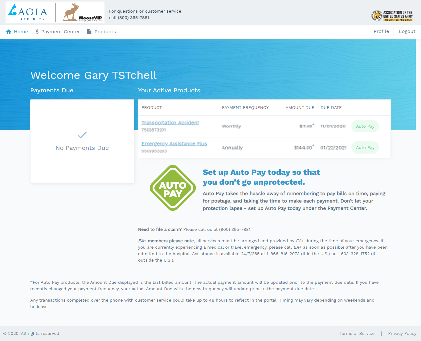
B2B Website Example: AGIA Affinity
AGIA Affinity is a great example of a very clear and easy-to-use design that makes finding information easy for its audience of insurers and member benefits associations. Moreover, by using Liferay for back-end data management and CIGNEX Datamatics as their implementation partner, AGIA built a website that improved site usability with fewer phone calls to customer support as a result. They have the flexibility to create individualised sites that meet the needs of each customer, whilst also providing easy-to-use self-service for their users.

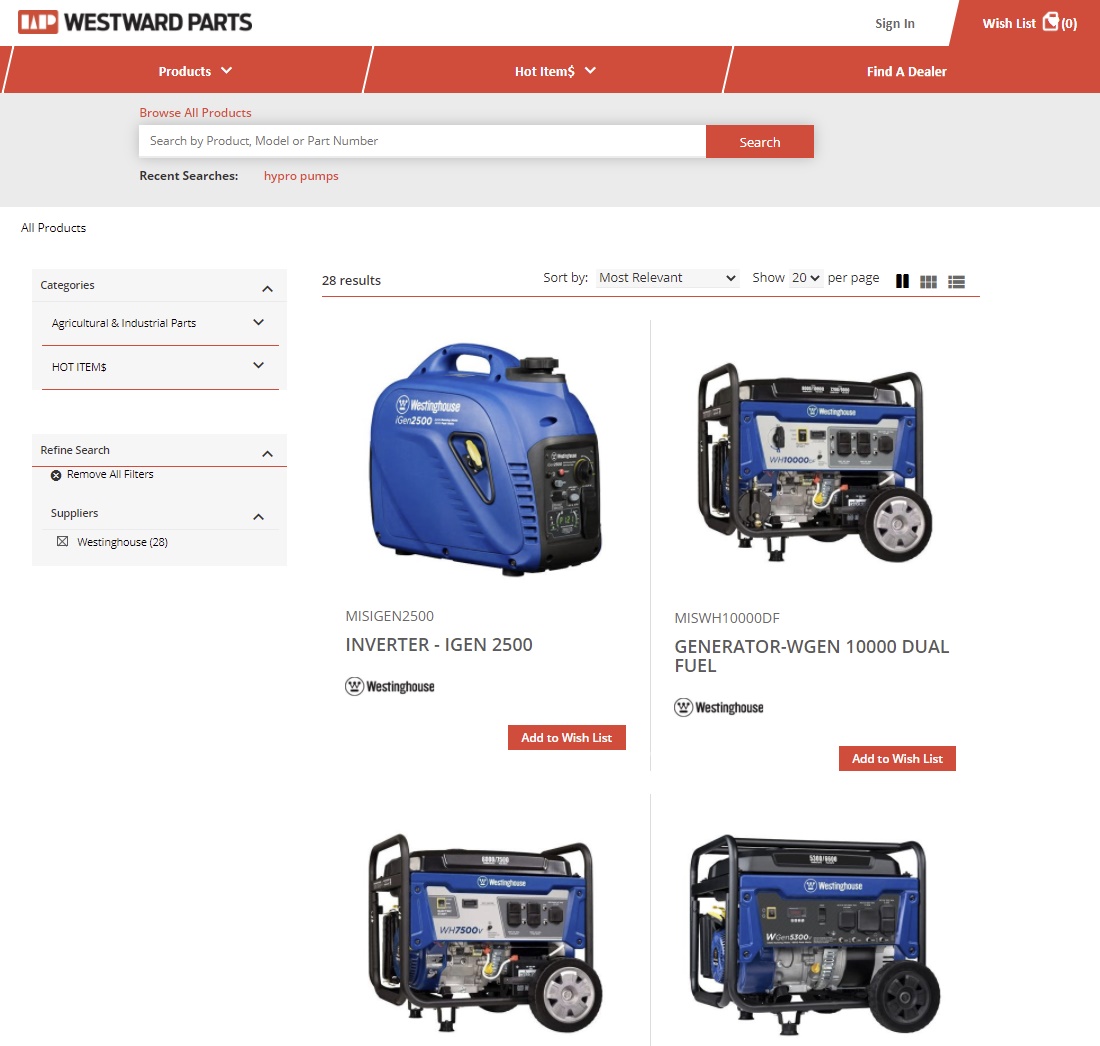
B2B Website Example: MacDon
MacDon, a manufacturer of agricultural equipment, implemented Liferay DXP to upgrade its dealer portal to be more mobile- and user-friendly, and build a new website and self-service portal for its subsidiary, Westward Parts, to boost sales. Working more closely with 1,000+ dealers, the company has since increased online transactions by 50% while saving IT resources, and provided greater functionality and a better user experience for its ecosystem of dealers.

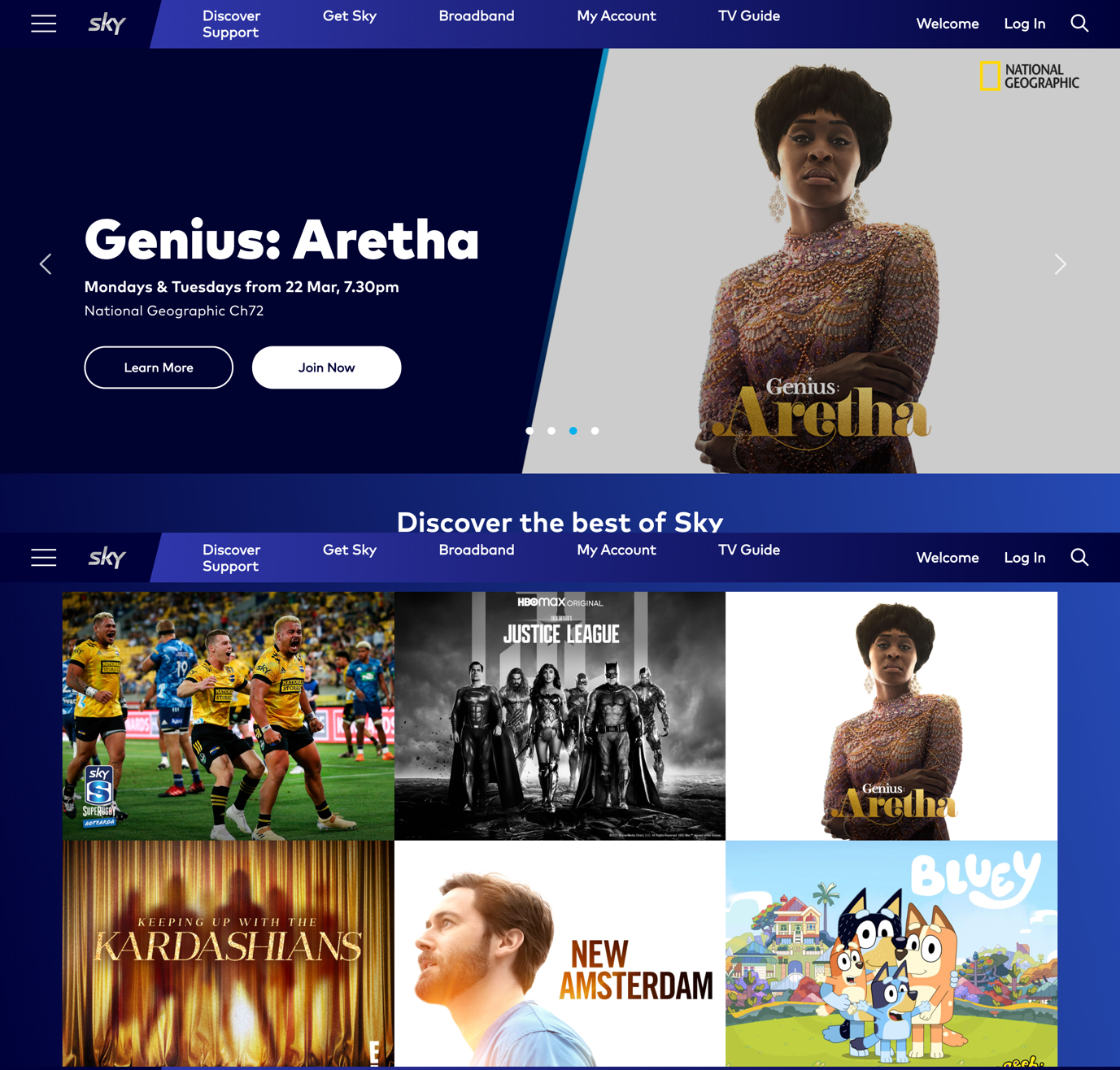
B2C Website Example: SkyTV
Here’s an example of a redesigned B2C website from SkyTV, a New Zealand digital broadcaster and telecom provider. Note that here in a B2C setting, the business opted for a more emotive, clean, and consumer-friendly design with a modern look and feel. Results have included a 140% increase in customer self-service, relieving pressure on the business. In addition, customer cart acquisition has increased to 7%, while auto scaling features allow for a faster time to market with development updates and content releases able to happen 1-2 times per day, instead of once every three weeks.

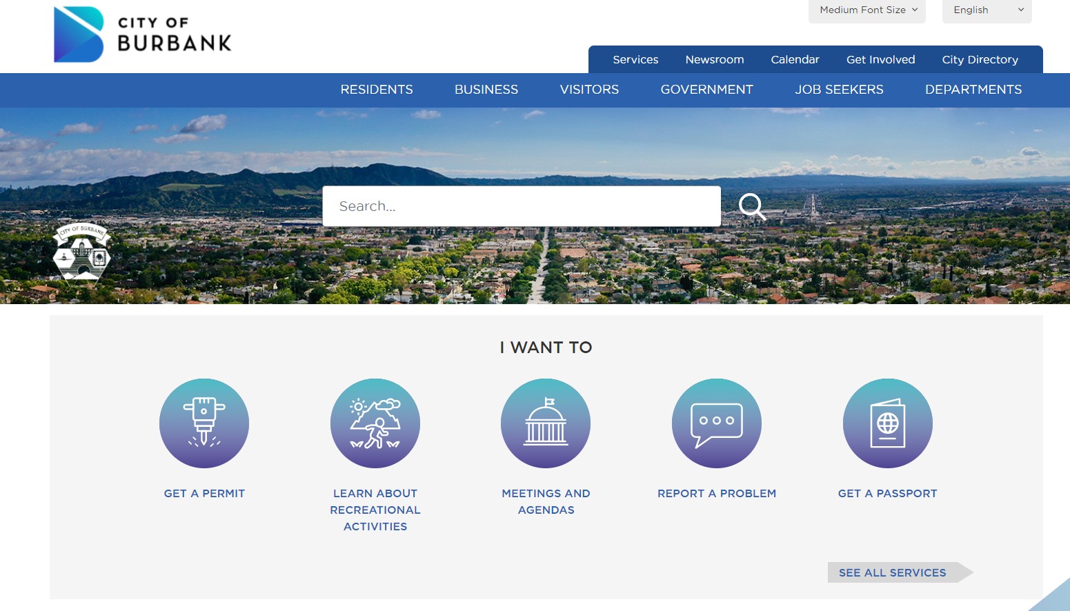
E-Gov Website Example: City Of Burbank
For something a little different in this example, a public sector organisation, The City of Burbank, created a new public-facing citizen website to reflect a modern digital identity, better educate visitors and constituents, and reduce customer phone calls with a self-service solution. The organisation has since decreased incoming calls, increased citizen reach, and elicited great feedback from users.

B2B Website Design Best Practices
Like any effective piece of digital communication, B2B sites should always be designed in a customer- or audience-centric manner, built around the needs of visitors using the platform from the home page onward. Here are some top B2B web design best practices to keep in mind.
Research - Use Google Analytics on your existing site to assess traffic data and understand which pages are performing best, so you can eliminate or improve underperforming pages. Use Search Console to resolve technical errors. Engage in competitor research to help you differentiate your business within the field.
Strategy - Create a clear value proposition for your business or solution built around the needs of your customer and place it front and centre on your website. Adopt a keyword strategy that identifies the correct keywords for your category / industry and include them across your content, URLs, and page names.
Planning - Build a sitemap that aligns with your keyword strategy and your buyer’s journey with the content they are looking for. Keep your navigation options simple, to the point, and intuitive so the user does not get overwhelmed with options. Adopt an agile mindset and launch your new website with a minimum viable product (MVP) you can add to over time with new iterations.
Design - Complete your site wireframe and copy / content before you begin designing so there is a solid template to guide your B2B website design. The best B2B websites focus web design efforts on the home page, which is often the first page (and the most important page) on your site for potential customers and new visitors. This is also where your value proposition should be made clear, along with a compelling hero image and a place to feature exciting products if relevant. Ensure your design is also optimised for mobile devices.
Optimisation - The best B2B websites also provide multiple conversion points as well as a call to action button (CTA), or buttons, across your B2B site and home page, rather than simply relying on one page with a general contact us form. These conversion points or call to action buttons should be specific and to the point. Examples of a call to action button include “request pricing”, “book a demo”, and so on. Keep your site relevant on search engines using organic search engine optimisation (SEO) techniques. Again, prioritise your home page for SEO and keyword density, but ensure you create unique meta titles and meta descriptions for each page. It’s also important to optimise headline and body copy to target keywords.
Delivering a B2B Website with Liferay DXP
The expectations of B2B buyers have been significantly influenced by their B2C experiences across all industries. Therefore it’s imperative for B2B companies to reflect these trends in their B2B web design to drive a competitive advantage.
Liferay DXP is well suited for helping to create visually appealing, compelling, engaging, and profitable B2B company websites because the solution helps connect your existing systems and processes while prioritising and boosting your customers’ personalised buying experience.
Request a demo today and discover how Liferay DXP can work with your current technology and organisational structure to meet your unique goals!


