Jim Robertson, Director of Digital Communications at NYU, and Andrew Gruhn, Solution Architect at sdg, presented at Liferay Symposium North America 2015. The following post is an edited transcript of their presentation at the conference.
For about 20 years, the NYUHome portal was a successful homegrown site. Functioning as a simple SSO aggregator, the NYUHome portal gave people the services they needed. Overall, the site took care of business and was fitting for what we needed.
With every new incoming class came higher expectations of what a digital university experience looked like. New generations had grown up on Snapchat and Facebook. They had known every answer to just be a click away on Google. They already had a lifetime of global shared connections. Not to mention, they were very active on their devices, which meant a growing need to create a good mobile experience.
After evaluating our existing solution against these new expectations, we knew NYU's Home portal needed to undergo a revamp.
Rethinking the Education Portal Blueprint
At this point, many portals were evolving to become more personalized. The NYU team really wanted to dig into what real personalization meant. Self-learning capabilities, along with modular and smart interfaces, were the inspiration to help inform our process. We also considered a stream of information that could be served up in light of new student expectations.
In short, the portal evaluation criteria came down to three main factors:
1. Would the platform have the right foundation out of the box? Functionalities like user management and role-based permissions were necessary parts of the NYU platform that no IT group would want to build from scratch.
2. Would the platform be optimized and easy to build integrations to third party apps? In our case, there was Shibboleth, external search engines, Google apps, Sakai and a number of other integrations that needed to be dated and brought into the education portal experience.
3. Would the platform contain a fully-featured, protected content management system? As a global university with satellite campuses in places like Abu Dhabi, NYU needed the education portal to have protected web content within authentication and proper permissions. So, we had to keep in mind the local customs and laws on ground in other countries regarding free speech.
The Launchpoint of NYU Global Home
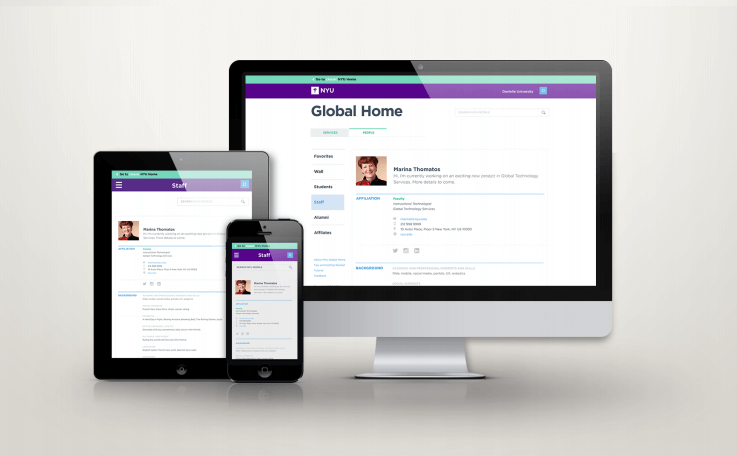
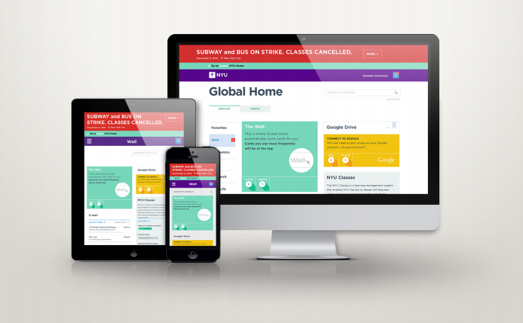
In 2014, NYU launched the "Global Home" project, a fully responsive site across several breakpoints from desktop to mobile. It's a card-based experience, which meant each card is accessing a backend service and returning some sort of functionality. The cards offered the ability to stream certain activities as they took place. For example, the stream would display the last thing that happened a minute ago, an hour ago, or a day ago. The cards also tracked the microinteractions between a certain user and his or her activity (e.g., interest in logging in through the service, their settings, and so forth).

The initial feedback was positive, but then real portal user feedback came in droves. A few revelations occurred to us. First, we learned that changing a user's experience based on these microinteractions could be jarring. Users would land on a page, click on something, navigate away and come back, only to find what they had just clicked on would be moved somewhere else (maybe below the fold or from left to right) based on reordering by relevance.
Secondly, the education portal was basically a lightweight static HTML site. Thus, it wasn't as zippy or fast in the performance department as people had been expecting. So, we took those two points and tried to incorporate them into the preexisting backlog and product vision.
Revision Makes Perfect
Over the course of 2015, the NYU team built out people profiles within the system. This was a core functionality envisioned for Global Home. The idea is to connect people to other people. NYU is a very siloed university, and students had been asking to meet with people across the university. So, we built profiles based upon systems of record (e.g., SIS systems, student permissions systems, alumni system), then allowed people to augment with additional data about themselves (e.g., interests, hometown, languages, social and academic likes).

In addition, we wanted to improve on two important elements of NYU Global Home:
- Search Functionality - To connect people across these dimensions, we needed to make sure the search worked across the portal system. Relevancy had to carry over from the service cards, applying to people. Collaboration on projects needed a relevance filter. To power search, we wanted to incorporate Elastic Search. It was more in synergy with our design decisions and it worked out well. In the perspective of the end user, any good search is pinned to Google search. Elastic has taken a fair amount of configuration to get to that point, but it's proven very helpful to empower that search.
- Notifications - We wanted to provide the ability to notify people within the education portal about various new features. We wanted to encourage people to engage with features as we rolled them out incrementally. NYU does a lot of messaging via "broadcasting" even though we try to target those messages. For NYU Global Home, we focused on "narrow-casting." Not so much "Hey all students, register tomorrow," but "Hey John, you can register tomorrow."
Here it is worth mentioning a bit about "perceived performance." Performance is something that you feel. The feel of the end user, the perceived performance, is way more important than any number, whether it indicates a supposedly fast or slow speed. In light of this, we sped up loading animations as well as changed rate and speed in which other UX elements worked so it felt tighter. If a NYU Global Home user feels it is slow, then all the numbers really don't matter—perception of performance is just as important as the numbers attached to performance.
Lessons Learned
1. Relevancy is hard. Google is obviously great at it, but then again they have billions of dollars to spend to get it right. The idea of relevancy (which we initially called "hotness") takes time and effort.
2. Performance is paramount. You can build all the features and functionality you want, but if someone logs in for the first time and has a bad experience, you sort of lose that good will with them. Performance is something you have to focus on—it's the bottom line.
3. Balance is crucial. There is a fine line between balancing out-of-the-box code/functionality with heavy customization. You can chase custom branches as hard as you want, but when it comes time for upgrades and upgrade paths, it gets tricky. There's a need for balance. You can't future-proof everything, but we're excited to be able to add both Elastic Search (available in Liferay DXP) and Senna.js so that we're in alignment with Liferay's future services over the next couple of years.
What's Next for NYU Global Home?
In terms of features for NYU Global Home, we want to add some individual and group communications so that when a user connects with somebody else who has shared interests, you can start a conversation. We also had on the roadmap this idea of location-aware features, which is more difficult than we initially thought because many students are wary about sharing their whereabouts with NYU.
Lastly, we are prioritizing onboarding all schools at NYU (Dentistry, Engineering, etc.), so that nine months from now we can retire "classic" NYU\Home and all our community will be on Global Home. On a broader scale, we always had an ongoing approach to relevancy. We did build custom algorithms early on to try to measure and track microinteractions, and we spent a lot of time and effort trying to tweak that.
Final Thoughts
In the end, we wanted to give everyone the ability to customize experiences they need. We allowed users to custom build out the pages that they want to see. That was the idea of making this whole user experience more personal. We hoped to have achieved that with this design.
Of course, we will always have more work to do. Our team at NYU is doing a great job of reaching out to a number of student groups to get feedback, likes and dislikes. As long as we continue efforts to meet the needs of our students and staff, we'll be in the right place.
Discover How to Deliver Content Targeting
View SlideShareSolution Design Group (sdg) is an IT consulting and application development firm, helping our customers solve their business challenges through technology. Visit their site to explore more of the NYU case study.