Often, what we consider the “best” examples of website design focus on stunning visuals or original layouts. For enterprises, however, there are functional elements of web design that are much more important to consider.
Whether you’re building a marketing site or an internal web application, enterprises have complex organizational needs that most web design advice doesn’t acknowledge. A beautiful UI is a good thing to strive for, but it shouldn’t outweigh a hard review of how overall user experience impacts your company’s bottom line, including performance, navigation, branding and analytics.
Here are some eye-opening statistics that show just how much impact website design has on your bottom line:
- Every dollar you spend on user experience improvement brings between $2 and $100 in return.
- 70% of website projects fail because users didn’t like the final results.
- Up to 15% of IT projects are abandoned and at least 50% of a programmer’s time during the project is spent redoing work. If proper measurements, goals and test processes were implemented upfront, the majority of this wasted time could be prevented.
- Spending 10% of your development budget on improving usability should improve your conversion rate by 83%.
A new coat of paint on your website isn’t going to fix the problems these statistics highlight. Many of them fall under the umbrella of user experience, aided by streamlined technology that forms the foundation of a truly well-designed website.
The below list isn’t meant to replace all of the other great information online that can help refine your organization’s website. However, for enterprises that need their website investments to show significant return, starting with these seven high-level elements will focus your improvement on the parts of your website that provide real business value.
1. Conversion-Centric Design
Optimizing your site for conversions is about determining what you want your customer to do next, then filtering out anything that distracts them. There are many different ways to guide your user to the preferred action:
- Directional Cues: Use icons, animations or bright colors that call attention to certain elements on the page.
- Z-Pattern and F-Pattern Layouts: People scan more than they read, and they generally do this in either a Z-shape or an F-shape. There are detailed guides available online to help you determine when to use which.
- Decrease Choices: There’s a well-known jam study that shows how too many choices make people less likely to make a decision. This doesn’t have to mean removing other choices completely. You can highlight one or two actions, then put the rest on another page for users who continue to look for more information.
- Measure Everything: Opinions shouldn’t lead to design changes unless they can be backed up by numbers or qualitative data (such as user feedback).
Of these seven elements, conversion-centric design will likely have the greatest impact on your bottom line. As long as your business goals are tied to keeping people engaged on your site, a conversion-driven mindset is a must for enterprise websites.
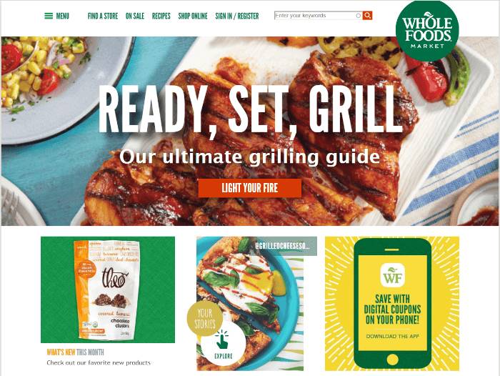
Whole Foods uses bright yellow to draw your attention to the digital coupons tile.
2. Balancing Business Goals and UX
Of course, optimizing for conversions leads to a discussion about what you should do when business goals conflict with a good user experience. You may want your user to click on a purchase link, but if they’re looking for something else and can’t find it, they’re likely to leave your site altogether. In that case, UX design should override your business goal.
UX and business priorities often seem at odds, but good design is good business. Stakeholders representing both sides should have a voice in the design of your website. Websites are business tools that need to drive value, but opting for a poor UX that forces users to behave a certain way can undermine your business goals in the long run.
For example, some retail websites require users to create an account before making a purchase. This can drive away visitors who only intend to purchase once and don’t want to go through an extra step. This can be turned into a better UX by moving the account creation process to the end — after the visitor has finished her purchase, ask if she’d like to add a little more info to create an account so that she can track her order and check out faster next time. This facilitates the process without sacrificing the business goal of keeping customers engaged.
3. Information Architecture
Information architecture refers to how you structure the content on your site. Liferay.com, for instance, uses a primarily hierarchical structure, with broad categories at the top that open up more narrow options as you click through. Attention to information architecture and navigation ensures that your visitors are able to find exactly what they need on your site, in as few clicks as possible.
There are at least seven different ways you can structure your content:
- Hierarchical: Possibly the most common structure, and one that users are used to seeing on public enterprise websites. This starts with broad categories of information and drills further down into more detailed content.
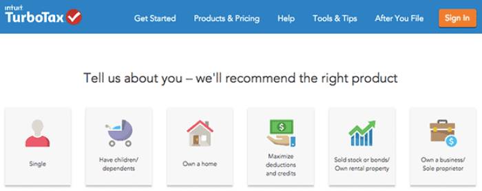
- Sequential: This structure requires users to go step-by-step through a determined path. This is often used for online products that need to gather a lot of information from users. TurboTax online is a good example. Users answer one question at a time, and the site takes care of funneling them to the correct next step.
- Matrix: Matrix structures allow users to choose how they navigate through content. This can be achieved with filtering options (so users can sort by date or topic, for example) or by clearly interlinking pages, so users can click through as needed.
- Alphabetical: Often used as a secondary navigational component to make sorting through content easier.
- Audience: Content that has been segmented by user groups. Clothing retail websites are the classic example, with items sorted for men, women, children, etc.
- Chronological: Organized by date and commonly used for blogs or other content-heavy sites.
- Topic: Organized by subject matter, as in wikis or online magazines.
These structures aren’t mutually exclusive, and many enterprises use them together to successfully organize their sites. Ultimately, the question you should ask is, How many clicks between my user and what he wants? Your information architecture should streamline that as much as possible. Conversion rates decrease with every new page users have to click through; decreasing that with a clear and enjoyable way to navigate your site will make it easy to engage visitors from the start.
4. Testing and Engagement Tools
If you think of website design only in terms of the front-end experience, you may overlook the importance of testing tools. Having an accurate and consistent way to measure engagement with your site ensures that you’ll have the data you need to find actionable insights and use them to increase those conversions.
There are tons of engagement tools that can measure everything from social media engagement to which push notifications are driving your users to unsubscribe. One way to filter them is to look for tools that help you listen to your customers and optimize for that balance between a great experience and goals that are tied to your KPIs. Don’t settle for tools that measure clicks or simple traffic views; measures like heat maps or A/B testing are more suited to helping you discover, not just what your users are doing, but why they’re doing it.
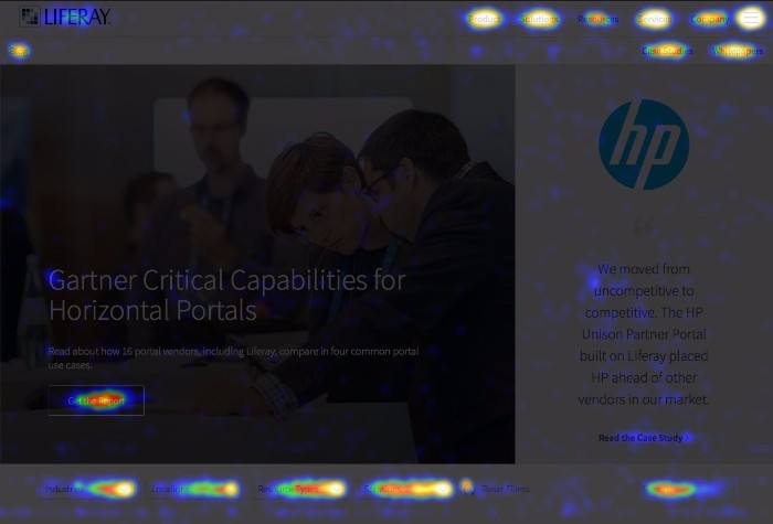
Heat maps show you where most people click on your web page.
5. Mobile
As Google continues to adjust its search algorithm for mobile sites, companies need to think about more than just making their website responsive. Now, Google penalizes things like large interstitial ads (which can be annoying on desktop, but are unbearable on mobile), unplayable videos, or poor site performance.
Keep in mind that, whatever information architecture or other design components you’re using for your desktop site should match the mobile experience. A well-designed website should support consistent experiences on every screen size, with the same ability to optimize for conversions, measure engagement and structure content as the desktop experience. Research shows that, if a business site doesn’t work well on mobile, 48% of users take it as the business not caring. That definitely isn’t helping your bottom line.
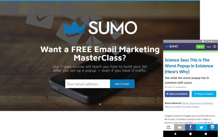
Sumo uses an interstitial ad to offer a free marketing class to its readers, but disables it for the mobile view. You can still see the content offered as text where it says “Bonus Material,” a much better experience for mobile users.
6. Modern Design Practices
Yes, at the beginning of this article, we said that good website design is more than the visual experience. However, that doesn’t mean you don’t need to keep up with current trends in web design. This is particularly important when it comes to your user interface (UI).
As new design trends spread online, people get used to websites looking and feeling a certain way. Research shows that website credibility is 75% based on aesthetics. In other words, a modern website design convinces users that you know what you’re doing. Even a company intranet can benefit from good typography, modern images and contemporary layouts to help boost user adoption and ensure your site isn’t a wasted investment.
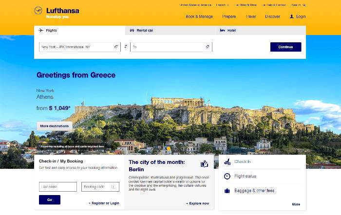
Lufthansa uses a bright, engaging image and simple navigation on its homepage.
7. Simplicity
We’ve already discussed the importance of decreasing choices for conversion optimization, but sometimes it’s important to step back further and consider the complexity of your site overall. Do you need a blog? Do you need the company page to include a full history of your founders? Is there content that hasn’t been viewed in months that you can prune? This makes the website overall easier to manage, and gives you more options for streamlining the content navigation on your site.
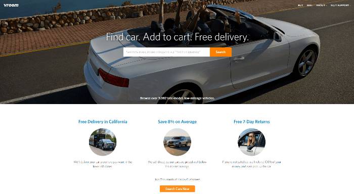
Vroom’s homepage has a clear, direct call-to-action that gets straight to what users are looking for.
These Elements Are Just a Start
There is much more to each of these elements than we’re able to cover in this article, but doing a quick assessment of website design based on these will give you a place to start. These seven core elements are meant to build a foundation for enterprise websites that need to get work done and deliver real business value to your company.
